
I love learning about new tools to make social media marketing more creative and effective, so I share some of my favourite tools with you at the start of each week. This week I’m recommending Google Mobile Friendly Test.
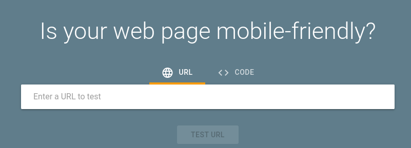
Use Google Mobile-Friendly Test to see how easily a visitor can use your page on a mobile device. Just enter a page URL to see how your page scores.
Having a mobile-responsive site (ie one that automatically changes its layout and placements of certain menus and buttons automatically) is important because firstly, not only are over half of patients searching online for health information on their smartphone, but secondly, Google now gives ranking priority to those sites that are mobile friendly. In fact, Google has stated that it will penalize websites that aren’t mobile-responsive, so if your site isn’t optimized for mobile devices, you’ll likely lose out significantly in the organic search rankings.
To check if your site’s design is responsive, enter its URL into this Google tool.
Here are the results I get for my website.
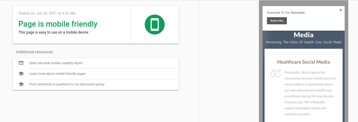
It only takes a few seconds to do and it’s an important element of your website optimisation.
For more tips on optimising your site, check out Digital Health Checkup: 10 Signs It’s Time To Redesign Your Medical Practice Website


 Health Care Social Media